

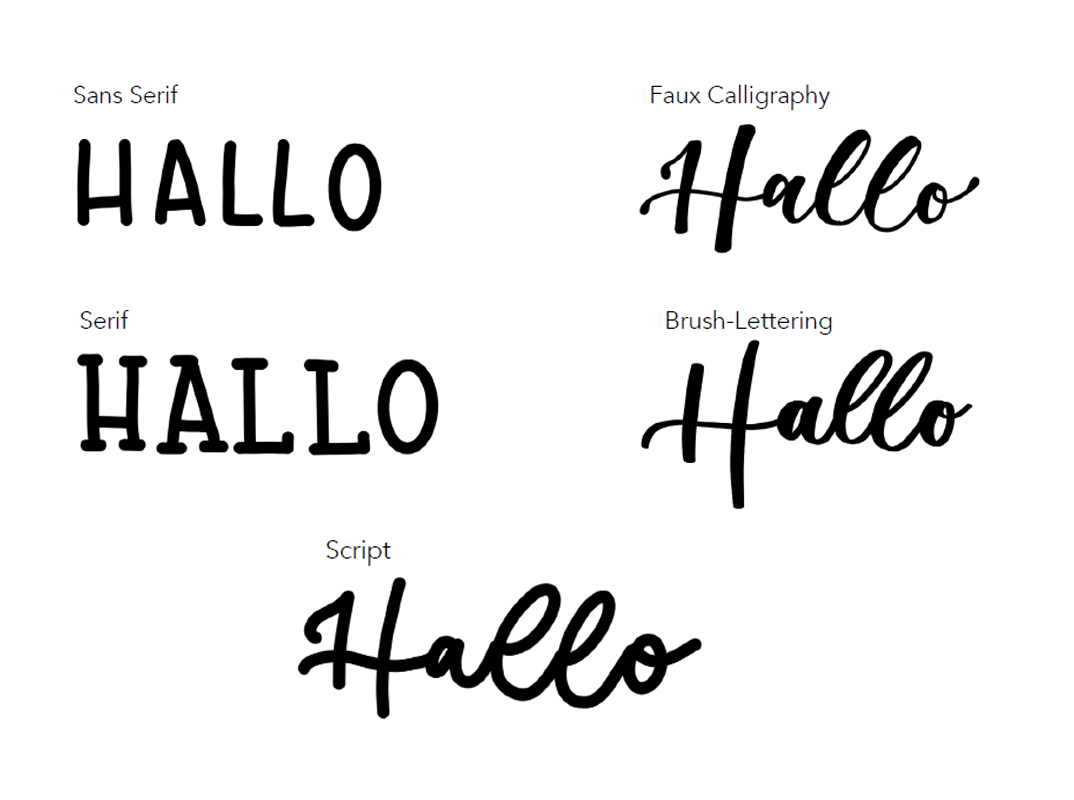
Lettering Styles
Each handlettering is unique. With the different font styles you will also find the right design for you. Or how about mixing them? San Serif, Faux Calligraphy, Serif, Brush Lettering and Script give you room to create your own design.
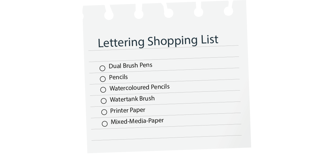
Which pen should I use?
When it comes to handlettering, choosing the right material is crucial to the end result. There are a variety of pens that can be used.
- Brush pens are excellent for brush lettering, a technique that uses varying varying pressure and stroke width to create a dynamic, calligraphy-like script.
- Felt-tip pens and fineliners can be used to draw clean lines and precise letters, making them the letters, making them the ideal choice for a clean and minimalist and minimalist writing style.
- Pencils and colored pencils can produce beautiful results, especially when working with shading and gradients.


Techniques and Structure
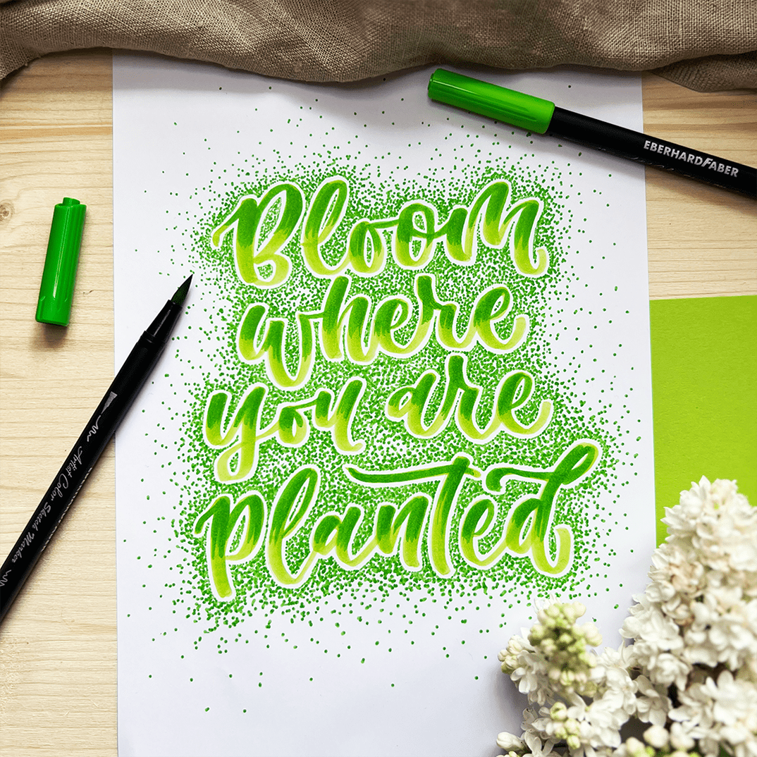
Stippling
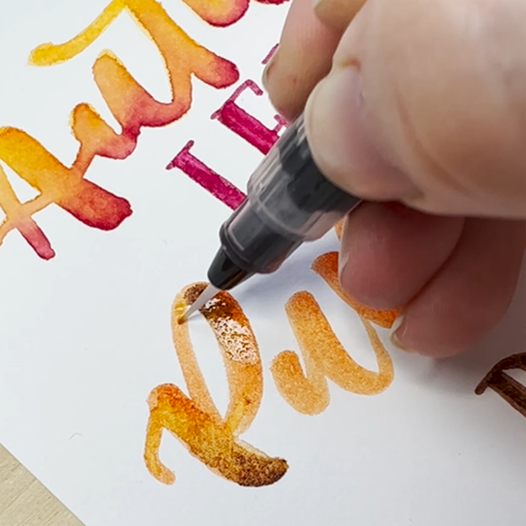
Blending & Aquarell

Compostion
When it comes to the layout and composition of a lettering, there are some important aspects to consider in order to create an appealing and balanced design. You should consider the following points:
Hierarchy: look at the text and identify the most important elements, such as the main text or keywords, that should be emphasized should be highlighted. Make these elements larger or particularly exciting to create a clear hierarchy and draw the viewer's attention of the viewer.
Placement: Make sure that the elements of the lettering are harmonious and balanced on the page. avoid clutter or imbalance by carefully designing the space around the around the letters.
Contrast: Use contrast to make the lettering more interesting more interesting. You can do this with the size, weight, or thickness of the letters weight, or thickness of the letters, but also with colors.
Legibility: Make sure that the text is legible. Also pay attention to contrast between text and background to ensure good readability.
Visualization: Think about how you can support the content of the lettering visually the content of the lettering visually. Experiment with appropriate illustrations, symbols or embellishments to complement the text.
Alignment and spacing: Make sure that the text is clearly aligned and keep the spacing between letters and words consistent
Download our full Lettering-Guide here (Ger.)
Lettering-Guide
, 0B


